Dc Htdocs Design-dept Ammar Ew-app Before-after.php
Coming from a DC fan like me, I was excited to use their new entertainment app! As I was using the app I noticed some details that can be worked on for better interaction. This became my next case study by focusing on the user research.
The Problem
- The app is overwhelming for users. What this means is the app is offering to much for the users or flow could be worked on (a.k.a the jam experiment).
- Users are not noticing some active buttons and are assuming some icons are active buttons. This is a problem because the product can lose users because your telling them to take extra steps on the flow map to get where they want to be.
- Lastly, the users are noticing the design of the interface needing to be worked on. A few users pointed out how it's kinda organized on home page but over all they would rather have the view all section.
Inspiration
Research Reviews
I started my research on the product by being a user of the product for a couple weeks. The reason I did this was because I wanted to make myself see the true potential of the product plus it helps me see things from a users perspective. After taking my own notes about the product I started to look into reviews or comments that users have made. Some of the pain points were identified:
- Can't connect to cast unless your in home page.
- Need to click movie/tv icon and then scroll to bottom in order to view all.
- Shop button takes you to online website, so not useful on the app.
- App freezes on me and have to open and close app every time.
- You can't download unless you go through account to comics and then comic detail.
Survey
A survey was conducted to g ather more information from the users' pain points with the current app and how they browse around. I shared a 3 questions survey on social media and 17 responded. For the first question, most responses were Comics and TV shows/Movies. The last question about 75% of results were 4. This tells me to focus on finding a layout that allows the users to view all on the top 3 content.
Interviews
After the survey an interview was next. Doing an interview will help visually see how users interact with the product and possibly notice a few side comments that you forget to say in surveys. 10 people volunteered to come in and use the DC Universe app and then answer a few questions at the end. Below you will see some feedback and notes I wrote down during the interview process.
Feedback/Notes
These were some comments I received:
"I like the features on the home page but I like the view all feature more when looking for comics or movies."
"Shop is fine, but I don't see the point of having it on the app if we don't get shipping free or a discount."
"I really like that I can see how many issues are on the comic before clicking."
And these are some notes I took down during the testing:
Pros:
- Like the view all feature.
- Community and Encyclopedia is nice to have.
- They love that they can download comics and movie/TV.
- Nice having the tag of 2 seasons or 20 issues.
- Favorite part is movies, TV series, and comics.
Cons:
- Movies and TV series need to be separated.
- Shopping is fine but it goes online so don't see a point on the app.
- Can't tell if the series or issue is downloading.
- The background is a little distracting.
- I mostly would use this app for movies, TV series, and comics. The rest is nice to have but not my main reason of subscribing.
Competitive Research
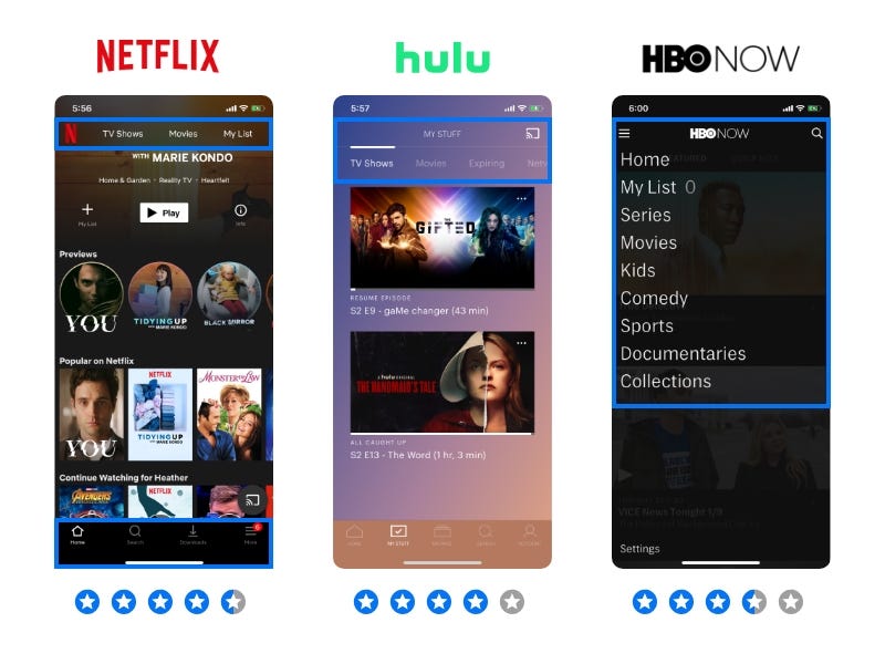
Instead of going straight to sketching solutions I wanted to do something different. I started to research what solutions other people have found useful, think of it as finding inspiration. This would be called 'competitive research' because it also allows me to see what other entertainment apps our users may have subscribed to.
I started by looking at other entertainment apps such as Netflix, Hulu, and HBO to see what other product designers have found helpful for users. For example, Netflix does a great job on solving the all feature and special organizing for the user. Allowing to have two navigation bars to separate the main content and categories was a great way to make it easier for the user to locate what the need in less steps. I also noticed Hulu doing the same thing on the top navigation but the categories would continue as you slide left. Lastly HBO navigation bar was nice to see for maybe the "more button" on the DC app.
Ideation
Personas
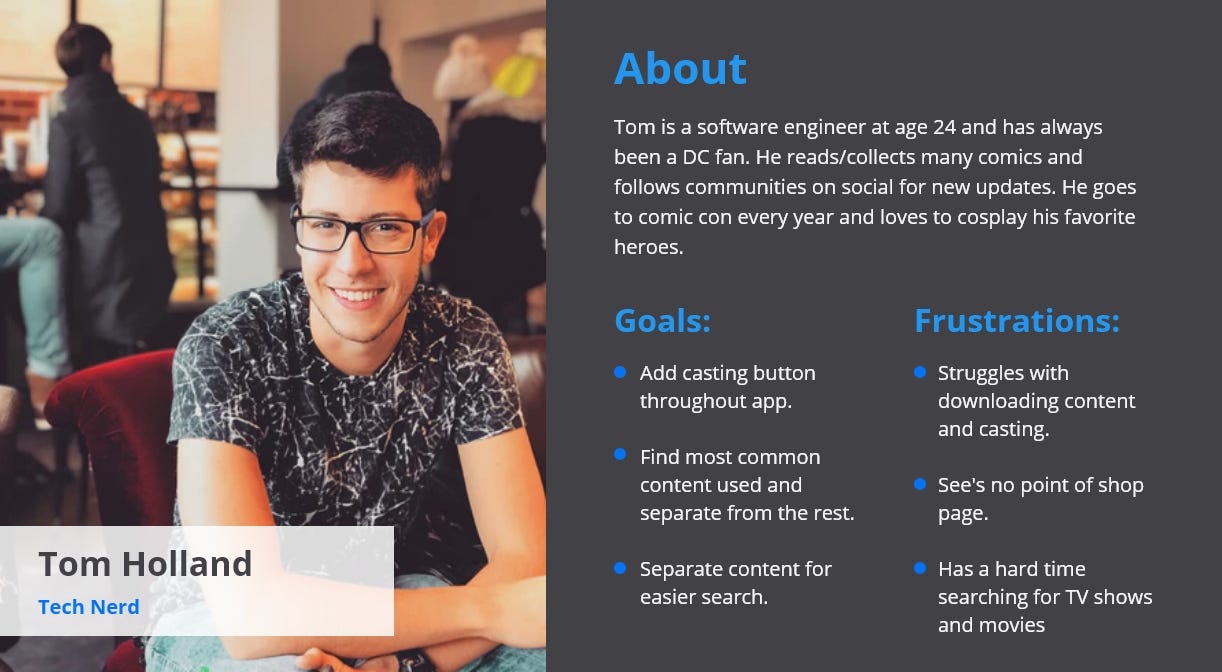
Now that the research is complete I could now move on to the ideation stage by starting to know who my audience is with personas. Below you will see a slide with 3 different people that will use the DC app. To sum up the description I knew children would be using the app for comic reads and the fun animation series such as Teen Titans Go, but the struggle was to know at what age can children know how to use a tablet and whens the best age for reading. The next one was easy because DC app already announce what there main users were on Twitter a while back. Lastly I wanted to target a parent because young parents are still into DC stuff but with a young child they may want to watch older movies/ tv shows with the children.
User Flow
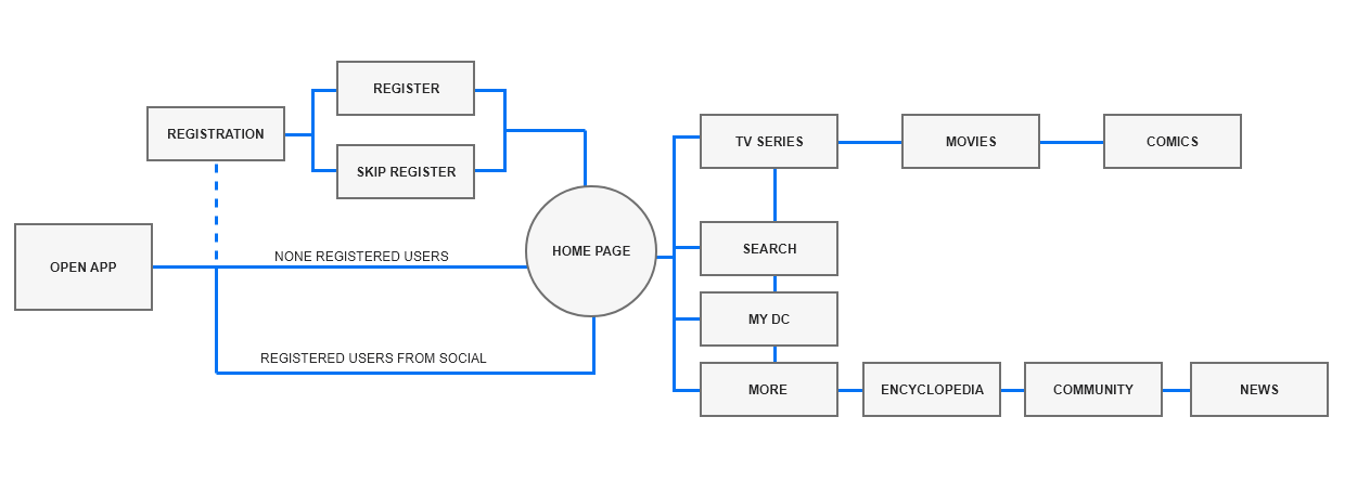
After observing the interactions with the app, I started to notice users getting lost or having to start over. I felt it was necessary to create a user flow at this point because this could help the app have a better interaction. Below is a small diagram I made that will help you have a better understanding of where I started.
Sketch
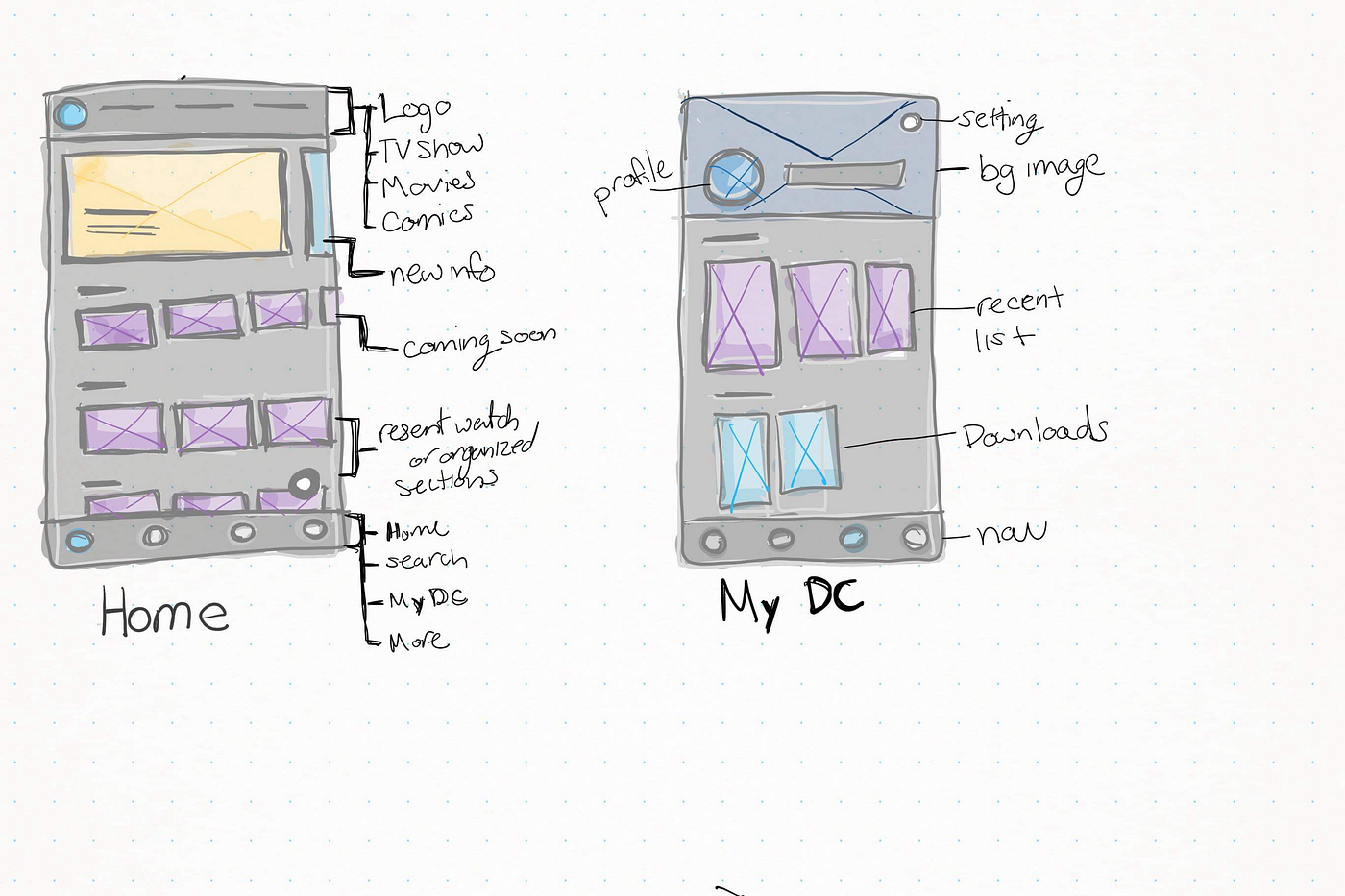
Now here is where the visuals start to come in. Now that I'm aware of the users flow, I started to sketch on my Window surface for some possible ideas of what the app could look like. Below is an image of the home and my DC page.
Wire-frame
Once the sketches were complete, I had to take the drawings to a digital layout. This gave me a visual guide for the app. It helped me arrange the interface elements while I focus more on the functionality rather than the details of the design. This was extremely helpful because I was able to really see if the interactions would work by testing them on my phone with the adobe XD app. It took a few redesigns to make sure I was happy with the results before moving to visuals.

Implementation
User Interface Design
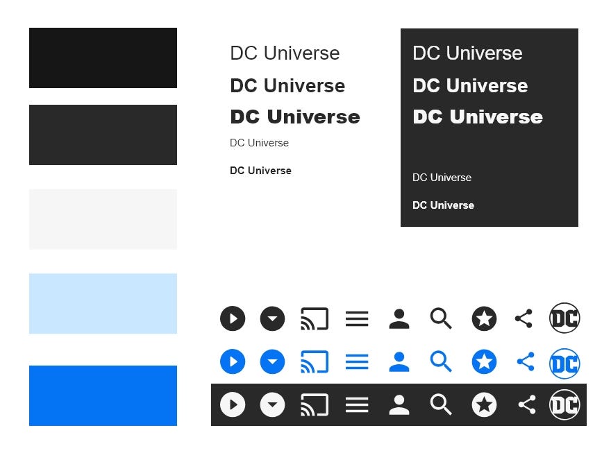
When starting to work on visuals I like to make a brand guide to make sure my design stays consistent. What I do is I will start by coming up with the colors and fonts, then I create my buttons and icon. After its all laid out I will save them on my XD guide so all I have to do is drop it on the art board. I couldn't get the DC Universe app so for now I used the DC app. From there I collected DC Universes colors and add the DC blue for a more attracted action color.
A/B Testing
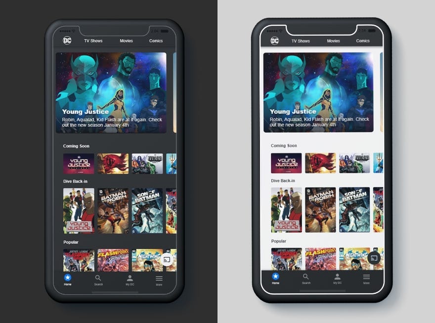
For this case study I thought it would be nice to do an A/B testing with the background color. Taking my wire-frame I came up with 2 different designs to test, light and dark. I noticed that DC comics had a light feature on the website, which made me think to test the two (specially when now apps offer users to chose backgrounds to help them use the app to their liking). In result I found that 75% of users love the dark side more than the light, but giving the users setting to change the background would be beneficial. Below I will explain further of how I came to these designs.
Before and After Image
Home page
Key Changes
- There are two navigation bars. The bottom main and the top will bring them to a view all layout for the 3 main content on the app (TV shows, Movies, and Comics)
- The top news feed, research showed that many users didn't know this was an active button. I changed that by making the image look more like a button and to let the user know there are more rotating.
- Lastly you may notice the coming soon row looks different from the rest. Movies and comics all come out in a vertical form, so I designed the app to not have names on bottom but to make the images vertical so the user can see the name better. The coming soon feature lets users know its not available yet but will be soon and they can click to see details.
Reflect
Creating a case study on this app was challenging and rewarding experience. I got the chance to really focus on research, and I felt better about what process I took to get my results. I had the chance to do a user interview and really look for the right questions to ask. Then I put myself in the users position by writing notes about interaction instead of design. But what I was most proud of was really taking this project through a research process. I felt this was where I needed to really focus my skills and learn from the process.
What's next?
Although my main purpose of the project was to focus on research, I would really like to do more on interaction design. I would like to really get a chance to work on this product more so if I were to continue this project I would work on the following:
- Deep UI design suck as prototype, transitions, and full design of product.
- Code the prototype to learn more about the back-end
- Put this design style to the other devices suck as Apple TV and website.
Thank you for reading and please let me know which of my design decisions you agree or disagree with. Tell me what you'd do differently and why. I would love to hear any feedback!
Dc Htdocs Design-dept Ammar Ew-app Before-after.php
Source: https://blog.prototypr.io/case-study-dc-universe-app-2992a07fe59c
Posted by: bellewliselther.blogspot.com

0 Response to "Dc Htdocs Design-dept Ammar Ew-app Before-after.php"
Post a Comment